Several of the projects I’m currently managing, like MockupData and MockupScreens, have complex graphical user interfaces. I have noticed that it’s hard to make this kind of program pixel perfect just by trying to measure the sizes and distances by eye, especially if you have an old/bad/small screen, so here is a small tutorial showing why GIMP should be another of your development tools.
1. Download and install GIMP.
GIMP (acronym of GNU Image Manipulation Program) is open source and completely free. It runs on several platforms, including Windows, Mac OS and Linux. Installation is pretty straightforward: just download and run the installer for your platform in Windows and Mac OS. In Linux, it’s probably already installed; if not you should be able to install it using your favorite software package management utility from your distribution.
2. Take a screenshot of your GUI.
Focus the window you want to capture and then press Alt+Print Screen in windows or Control+Command+Shift+3 in Mac OS. For Linux you can check this site, which also contains more options for Windows and Mac OS. Then, open GIMP and select Edit → Paste as → New Image.
Alternatively, drag and drop an existing screenshot image file into the GIMP title bar, or use the File menu item to open an existing disk file or an image URL.
3. Use the GIMP measuring tool.
Take a look at the following icons. Are these of the same size?

Let’s use the GIMP measuring tool. First use the zoom so you get a big image on the screen, and then click on the Measure icon in the toolbox, and then make sure the Use Info window checkbox is enabled. Next, left click on the starting point and drag with the mouse to the ending one, then release the mouse button. The distance between the two points will be displayed on the screen:

Now let’s measure the second one.

There is a 5 pixel difference. We asked our developer to fix this and make some other changes to the buttons:
- Making them smaller, as they looked so big compared to other items in our app. We resized them from 35*26px (left) and 30*26px (right), to 28*22px (both).
- Adding 2 pixels between the icons.
- Make the font a bit smaller.
- Place the plus and minus signs just under the shadow line (this is the line where the background color of the icon changes, thus giving a 3D effect).
Here is the result. You can download and zoom it with GIMP if you want to check the changes:

4. Use the GIMP color picker.
Now let’s look at the following toolbar:

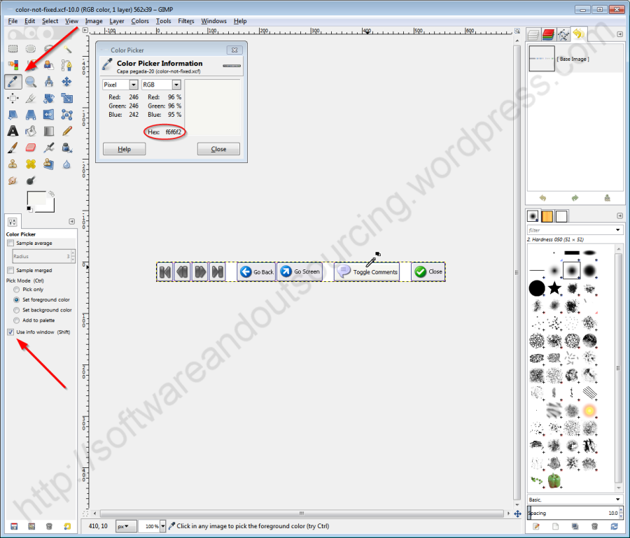
Are all buttons of the same color? Let’s check it with the color picker tool. Click on the pointed icon in the toolbox, and then check that the Show info window option is enabled. Click on the background of the Go Screen button.

We get a color value of eae8ed. Let’s check the Toggle Comments one.

Now we get f6f6f2, so the colors are actually different. We also fixed it, and here is how it looks now:

5. Conclusion.
The appearance of your product is as important as its functionality. With similar features and functionality, a user will choose the one with better appearance, and even if you can’t notice them in your old laptop, people with modern monitors will be able to see them. GIMP allows you to make sure that your GUI elements will look homogeneous to every user with little time and effort, while being completely free software.
